The Switch control
The Switch control can be used for Yes/No columns. It can return the value 1 (one) for true and 0 (zero) for false, but it can also be customized to return any value for true or false.
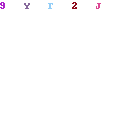
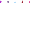
Examples of a Switch control:
Type : Switch
Name
Provides a unique name for the control.
Binding
Indicates if the control is
- Unbound
- Bound to list column
- Is a label for a control bound to list column
Enabled for new records
Sets if the control will be enabled or disabled when the forms handles a new record
Enabled for existing records
Sets if the control will be enabled or disabled when the forms handles an existing record
Required
Marks the cotnrol as Required.
By default, the system recognizes required fields and marks them with this flag. Additionaly, controls can be marked as required event if the bound column is not.
Enabled Formula
Set an expression then will be evaluated during run-time and enable or disable the control.
The expression must be in javascript and should return a boolean value.
Dependencies between controls are automatically identified and the expression is re-calculated every time a control affecting the formula changes.
Example :
|
1
2
|
Code
form.GetControl(“c_Status”).GetValue() != “Open” && form.UserInGroup(“Administrators”)
|
Visibility Formula
Define a valid formula (using javascript) that will be evaluated during runtime to show or hide the control.
The expression should return a boolean value.
For example :
|
1
2
|
Code
form.FieldValue(“c_Status”) != “Rejected” || form.UserID() == “1”
|
Value
This property defines how the control will get its value.
Here are the available options :
- The value is Static (this is the default for label controls)
- The value will be provided by the user (Not applicable for labels)
- The value will be calculated by a formula
- The value will be retrieved from a list query
- The value will be provided by a web service call
- The value will be provided by a SQL query
Static value
A static text must be set in the appropriate designer control.
Formula
A javascript expression must be set that will provide the value for the control.
If the formula contains references to other controls, dependencies will be automatically identifies during run-time and the value will be updated to reflect changes.
Example :
|
1
2
|
Code
form.FieldValue(“c_Active”) ? “Yes” : “No”
|
There is an additional option that instructs the form to perform calculations only for new records. Existing records will keep their original value.
List Query
A predefined list query is bound to the value of the control. So during form initialization, the specified list query is executed and if it returns any item, it selects the first one and it will apply the value to the label based on the following rule :
If a Field Name has been selected in the corresponding box, that specific column will be used from the list item to fill the control value.
If the Field Name is left blank, the first column retrieved will be used.

Web Service
The same as above, the required web service is selected and after the web service retrieves data, the first item will be used to update the control value. If no Field Name is set, the control will receive the first field of the retrieved item.
SQL Query
Works the same way ListQueries and Web Service works.
Default Value
The default value has any effect only of the control is bound to a list column.
For unbound controls, the default value is ignored.
You may set a static value here or use a formula by starting your input with the “equals” (=) sign.
Example :
|
1
2
|
Code
=form.UserInGroup(1) ? “1” : “0”
|

Width
Defines the width of the control.
When the value is zero, the maximum allowed width will be used.
Height
Defines the control height.
If the value is zero, the height property will not be set.
H.Alignment
Defines the horizontal alignment of the parent cell (values : left, right, center)
V.Alignment
Defines the vertical alignment of the parent cell (values : top, bottom, center)
Fore Color
Not Applicable for the Switch control.
Back Color
Not Applicable for the Switch control.
Cell Color
Defines the color of the parent cell.
Font Size
Not Applicable for the Switch control
Margin
Sets the margin applied to the control, that is, the spacing between the control and the cell borders.
Font Bold
Not Applicable for the Switch control
Italics
Not Applicable for the Switch control
Not Applicable for this control
ShowText
Shows or hides the control text.
Animation
Select the animation effect. Available effects: Bounce, Linear, Easein, EaseOut, EaseInAndOut, None(-).
AnimationTime
The time of the animation (in milliseconds).
TrueText
The text for the TRUE state of the control.
FalseText
The text for the FALSE state of the control.
TrueValue
The saved value for the TRUE state of the control.
FalseValue
The saved value for the FALSE state of the control.
Sets the script that will be executed at the value-change event of the control.
Example :
|
1
2
3
4
5
6
|
Code
var value = form.GetControl(“c_Title”).GetValue();
if (value == “Open”) form.HideSection(“Details”);
else form.ShowSection(“Details”);
|
The ColumnHistoryViewer control
In order to support versioning in lists as well as AppendText columns, the ColumnHistoryViewer control has been introduced.
It allows the user to retrieve historical data from columns.

Type : ColumnHistoryViewer
Name
Provides a unique name for the control.
Binding
Indicates if the control is
- Unbound
- Bound to list column
- Is a label for a control bound to list column
Enabled for new records
Sets if the control will be enabled or disabled when the forms handles a new record
Enabled for existing records
Sets if the control will be enabled or disabled when the forms handles an existing record
Required
Marks the cotnrol as Required.
By default, the system recognizes required fields and marks them with this flag. Additionaly, controls can be marked as required event if the bound column is not.
Enabled Formula
Set an expression then will be evaluated during run-time and enable or disable the control.
The expression must be in javascript and should return a boolean value.
Dependencies between controls are automatically identified and the expression is re-calculated every time a control affecting the formula changes.
Example :
|
1
2
|
Code
form.GetControl(“c_Status”).GetValue() != “Open” && form.UserInGroup(“Administrators”)
|
Visibility Formula
Define a valid formula (using javascript) that will be evaluated during runtime to show or hide the control.
The expression should return a boolean value.
For example :
|
1
2
|
Code
form.FieldValue(“c_Status”) != “Rejected” || form.UserID() == “1”
|
Value
This property defines how the control will get its value.
Here are the available options :
- The value is Static (this is the default for label controls)
- The value will be provided by the user (Not applicable for labels)
- The value will be calculated by a formula
- The value will be retrieved from a list query
- The value will be provided by a web service call
- The value will be provided by a SQL query
Static value
A static text must be set in the appropriate designer control.
Formula
A javascript expression must be set that will provide the value for the control.
If the formula contains references to other controls, dependencies will be automatically identifies during run-time and the value will be updated to reflect changes.
Example :
|
1
2
|
Code
form.FieldValue(“c_Active”) ? “Yes” : “No”
|
There is an additional option that instructs the form to perform calculations only for new records. Existing records will keep their original value.
List Query
A predefined list query is bound to the value of the control. So during form initialization, the specified list query is executed and if it returns any item, it selects the first one and it will apply the value to the label based on the following rule :
If a Field Name has been selected in the corresponding box, that specific column will be used from the list item to fill the control value.
If the Field Name is left blank, the first column retrieved will be used.
Web Service
The same as above, the required web service is selected and after the web service retrieves data, the first item will be used to update the control value. If no Field Name is set, the control will receive the first field of the retrieved item.
SQL Query
Works the same way ListQueries and Web Service works.
Default Value
The default value has any effect only of the control is bound to a list column.
For unbound controls, the default value is ignored.
You may set a static value here or use a formula by starting your input with the “equals” (=) sign.
Example :
|
1
2
|
Code
=“User : “ + form.UserFullName()
|
Width
Defines the width of the control.
When the value is zero, the maximum allowed width will be used.
Height
Defines the control height.
If the value is zero, the height property will not be set.
H.Alignment
Defines the horizontal alignment of the parent cell (values : left, right, center)
V.Alignment
Defines the vertical alignment of the parent cell (values : top, bottom, center)
Fore Color
Defines the fore color of the control
Back Color
Defines the Background color of the control.
Cell Color
Defines the color of the parent cell.
Font Size
Declares the font size of the text
Margin
Sets the margin applied to the control, that is, the spacing between the control and the cell borders.
Font Bold
Changes the weight of the font used
Italics
Changes the font style for the control text
Not Applicable for this control
ColumnName
The column internal name that we want to show historical data.
ItemCount
The number of history records to retrieve. Zero (0) brings all the records.
Sets the script that will be executed at the value-change event of the control.
Example :
|
1
2
3
4
5
6
|
Code
var value = form.GetControl(“c_Title”).GetValue();
if (value == “Open”) form.HideSection(“Details”);
else form.ShowSection(“Details”);
|
Designer Options
The latest version of Powerforms HTML includes two new options in the Designer -> Options section, Show Progress Form and Tab Animation.

Show Progress Form
This option refers to the progress form shown while the actual form is loading.

The available options are:
Always – Will always show the loading form.
Never – Will never show the loading form.
InitialLoading
LazyLoading
Tab Animation
This option refers to a visual effect which occurs whenever a tab is selected.
The available options are:
FadeIn – Will show a fade in effect when a new tab is selected.
None – Switching to a new tab happens instantaneously.
Setting Column Span for Controls
A newly added feature in Power Forms Designer allows the user to easily modify a control’s column / row span using the designer view. Using buttons placed on the control, the user can easily and effectively design the look of a control and subsequently, the entire form.

Hovering over a control causes two buttons to appear on the left side.  Each of these buttons represents the direction in which the user wants to expand or contract the size of the control. The only restriction set while modifying is that a control will always occupy at least one column and one row.
Pressing the right arrow increases the number of columns occupied by the control. Pressing the left button decreases the number of columns occupied by our control.

Saving our changes, the control’s appearance will be as follows:
Required Fields
Required fields (marked as such in the List Settings) are automatically identified and marked in the form designer (IsRequired property).
You can mark any field as required by raising the “Required” flag in the control properties window.

Inside the designer, in the “Options” tab, there are 2 options for required fields:
Required Field Border and Mark Required Fields.
The first property defines the border color for required fields and the second one sets if the form should apply the required field color.

NOTE : The cells containing required fields are automatically given the predefined “pf-required-field” class which you can override by adding a style element in the Scripts > Includes section of the designer.
For example :
|
1
2
3
4
5
|
<style>
.pf-required-field {border:solid 2px #A00;}
</style>
|
The above script will change the required controls to something like the following :
Customizations for lists with multiple content types
PowerForms HTML supports multiple content types within a Sharepoint list by providing the functionality to create a different customization file for each content type. Effectively, this means that you can have different looking and functioning forms for each content type.
Our example list has two different content types: Contact and Item. To create a customization for each individual content type, we need to save changes made to the Editor for each content type. Doing so, will create two different customizations.
We made and saved changes to the Contant and Item forms in order to provide different functionality.
Contact Form

Item Form